Masterferry is a brand dedicated to the mass sale of ferry tickets between different locations. It was a completely abandoned project inherited from another company, and when it came to me, it was an absolute mess. The brand identity, usability, and accessibility had not been properly addressed. I had to tackle the work from scratch on my own, but I did it with a lot of enthusiasm and excitement.
Problem
When I received this project, no development, UX, or UI design had been done. The client had no definitive branding or working process. They needed the UX design team to craft this concept from the ground up, creating a responsive web application (desktop and mobile), making sure the interactions and flows are seamless, intuitive, and visually pleasing.
Solution
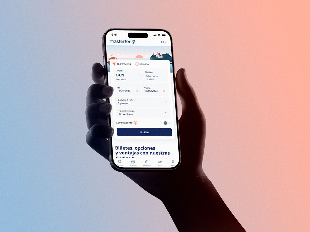
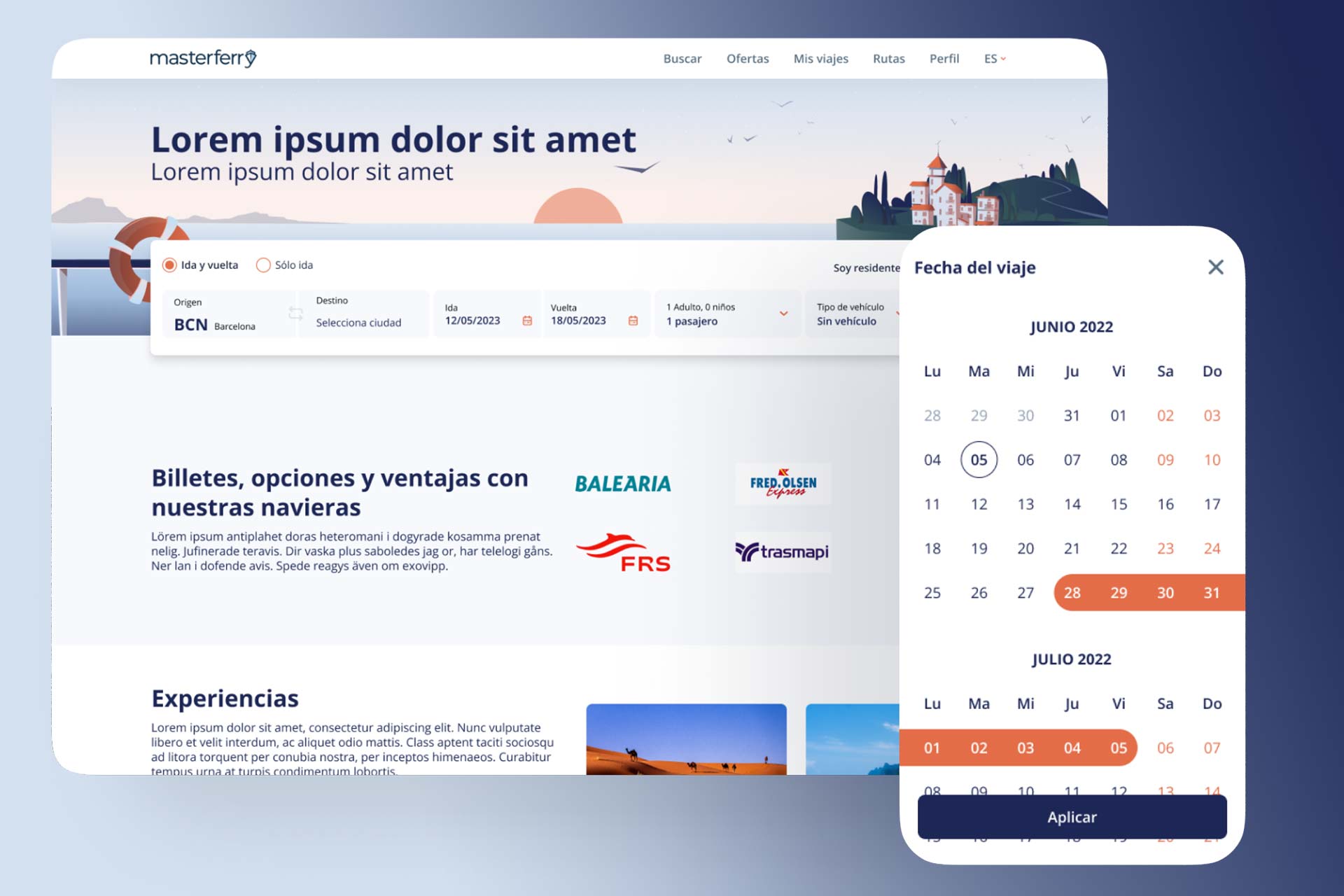
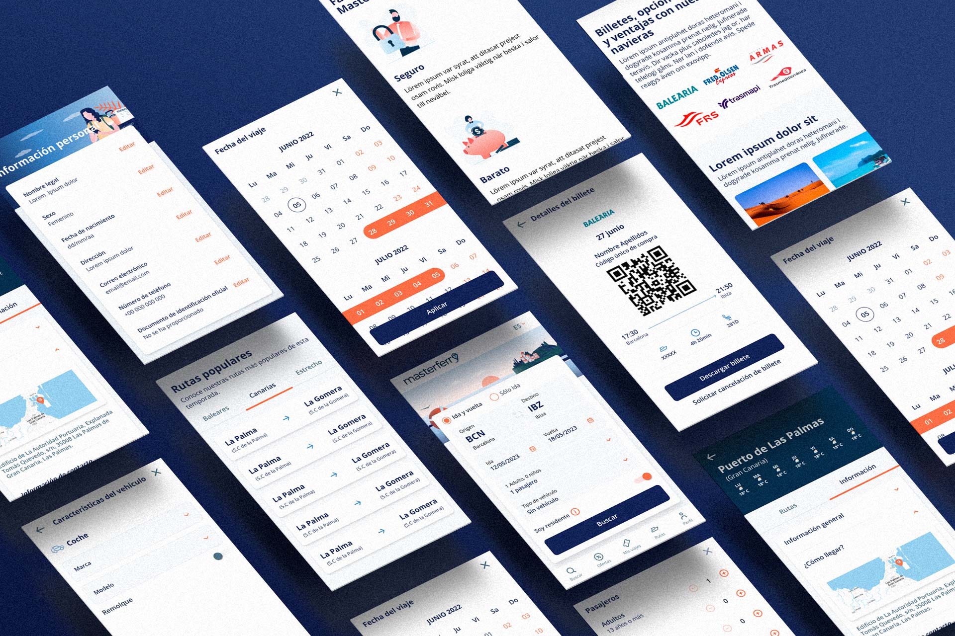
I developed a responsive web application that allowed users to purchase ferry tickets for multiple journeys in an easy and intuitive way, in addition to managing a profile section with many options such as favorite routes, ticket management, etc.
User flows
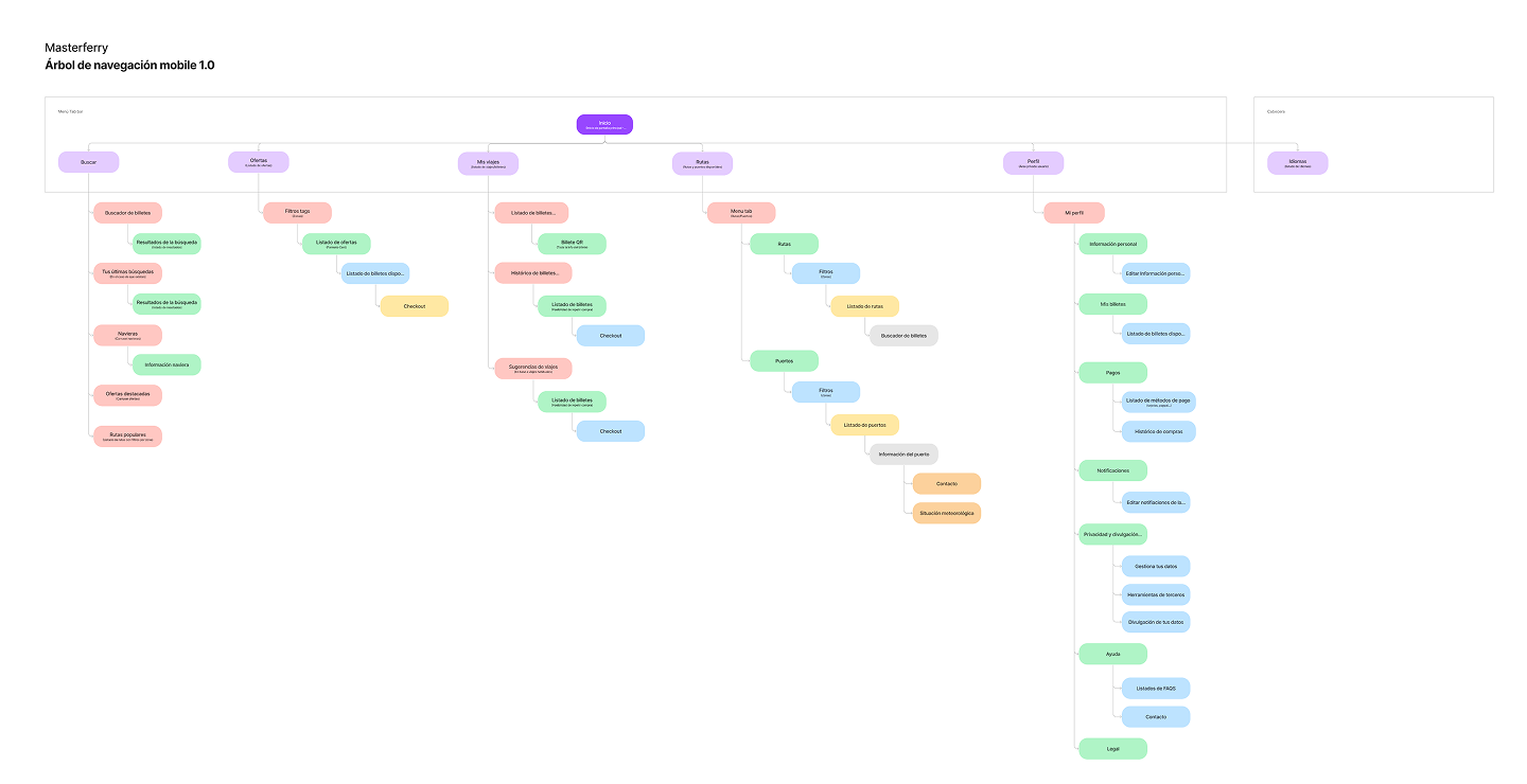
I worked hard on the different types of user flows for the application, as well as the navigation tree.
It was important for me to understand how each flow worked, especially those related to registration, ticket search, and checkout.
I wanted to create many more, but due to the project's budget constraints, I wasn't able to develop them all.
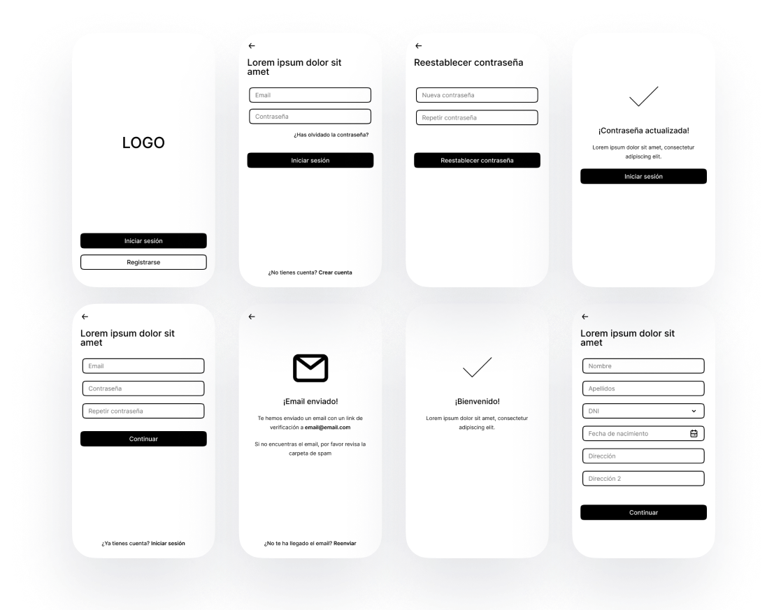
Wireframes
In the first round of medium-fidelity wireframes, I assigned wireframes according to the user flow the team member previously worked on.
Since this application was a responsive design, I made sure to have the team start with screens for mobile first, before designing for the desktop versions.
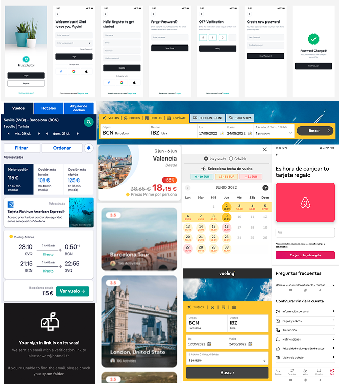
UI Inspiration
At the start of the project, each team member gathered examples of competitor products and UI inspiration. I led design sessions to analyze these references, discuss design choices, and review competitor flows.
This collaborative process guided our UI and color exploration, helping us identify best practices for creating a responsive layout.
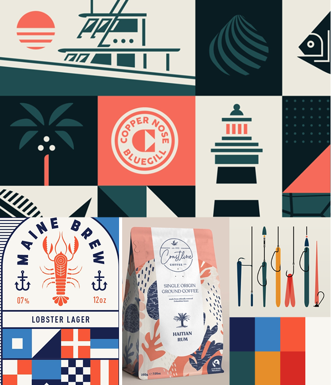
Color Inspiration
The client was open to color suggestions, so we explored palettes appealing to a young-to-middle-aged audience while staying connected to the naval theme.
By testing colors across different screens and custom illustrations, we identified which palettes best aligned with the brand.